
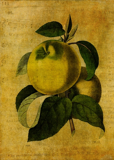
Vintage apples from The Graphics Fairy and textures from 2 Lil’ Owls. I haven’t uploaded it for sale yet but I thought you might like it, particularly Mary of Oil Pastels for Mary as we were talking about doing something like Copper Pear. I told her I could never repeat a particular kind of beauty!
Do you think I need to make the apples greener? I’ve been farting about with it forever and I’m still not sure.
Soon to be available at the following galleries:
Redbubble
Crated
Zazzle US
Zazzle UK
Fine Art America
Fine Art England
Saatchi Art
Take care and keep laughing!


Adam’s Apples or Eve’s Apples or God’s Apples? 🙂 Beautiful Apples 🙂
LikeLiked by 1 person
When I ‘up’ the green, I’m thinking Eve’s Apples would be a better title!
LikeLiked by 1 person
Have a weekend filled with smiles. Janet:)x
LikeLiked by 1 person
You too! xx
LikeLike
A tiny hint of that orangey red bottom left of apple I reckon! Doesn’t need more green they look just like the golden apples we have in the orchard here beautiful! 🙂
LikeLiked by 1 person
Interesting – thank you for your thoughts, Jane. x
LikeLike
That was darned presumptious of me to suggest any changes! Looks good as it is 🙂
LikeLiked by 1 person
I welcome it. In fact, I lean towards what you suggest as whenever I add add any kind of green, it just doesn’t look right. Thank you. 🙂
LikeLike
My pleasure Ma’am! 🙂
LikeLiked by 1 person
You have a great eye for vintage Sarah. I like Jane’s suggestion of adding a bit of burnt sienna I think it will give the apple a little depth and stand out just a bit from the background.
LikeLiked by 1 person
I’m so glad you agree with Jane, Mary. I have today been playing around with a digital version of burnt sienna but shall wait a few days before reappraising. Bless you for commenting.
LikeLiked by 1 person
Have a great weekend Sarah.
LikeLiked by 1 person
I’m intrigued to see how Jane’s suggestion works out. I wouldn’t go for more green but have very bad eye for visuals, so you should probably do the opposite!
LikeLike