
It’s Week 14 of the Photo Rehab Cover Makeover run by Desley Jane of Musings of a Frequent Flying Scientist and Lucile of Lucile de Goday. They have chosen another book by a fellow blogger—The Incident at Montebello by Patti Moed of Pilotfish. Ms Moed is an award-winning creative artist who’s worked as a university professor, writer, textbook editor, photographer, corporate trainer, educational consultant, and instructional designer; that’s some CV!
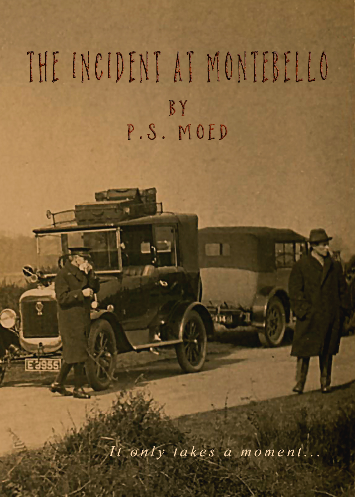
I have used a family photo which you might recognise from my treatment of it for When Worlds Collide. I can’t pretend the vehicles are spot-on for 1930 but I consider them close enough to give a flavour of Patti’s book (which I have already bought for Kindle and am very much looking forward to). The strap line I’ve used is my invention!
‘The Incident at Montebello is a historical novel based on a true event— In 1930, Italian Premier Benito Mussolini was driving through the Italian countryside with Cornelius Vanderbilt, Jr. when his car struck and killed a little girl, Sofia Buonomano. The Buonomano family is torn apart by Sofia’s death and is caught in a political firestorm that spreads from their village to Rome and across America and Europe. One family member, 16-year-old Isolina, witnesses the accident and recognizes Mussolini as the driver.’
Click here for instructions if you would like to take part in future challenges.
#BLOGSHARELEARN LINKY PARTY OCTOBER 16/15

Take care and keep laughing!


Reblogged this on perfectlyfadeddelusions.
LikeLiked by 1 person
Again, you have captured the essence of what the book is about…..I love this image….and it’s a family photograph – how wonderful. Keep smiling, :)xx
LikeLiked by 1 person
Bless you, Janet. I’m chuffed you think so. Keep smiling! xx
LikeLike
Will do:)x
LikeLiked by 1 person
What a fascinating story!
LikeLiked by 1 person
Yes!
LikeLike
Great attempt, Sarah. I think your cover speaks many words about what the book is about. Well done.
LikeLiked by 1 person
Thanks so much, Hugh!
LikeLike
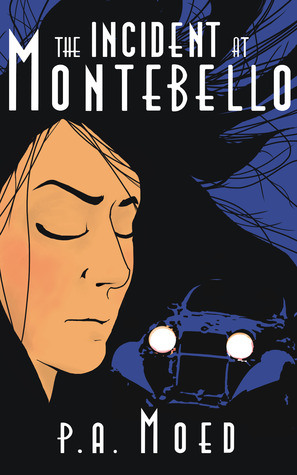
I have to say that your cover has more atmosphere, and a better sense of period. I like it a lot. I do prefer the font on the original though, as it suits the era. However, I feel it clashes with the contemporary cartoon feel of the main picture.
Your photo, that font. How about that?
Best wishes, Pete. x
LikeLiked by 1 person
I’ll go with that, Pete!
LikeLike
Wow. I love this! I am thrilled that you’ve captured the essence of my book in such a captivating way. Great job! How’d you like to do the cover for my next book???
LikeLiked by 1 person
Gosh, how lovely of you. I’d love to do the cover of your next book!
LikeLiked by 1 person
This is such a creative challenge. I really love the idea of connecting writers, readers, and visual artists. And I’d love to have a cover for the next book that uses a photograph for the primary image.
LikeLiked by 1 person
Bring it on. 🙂
LikeLiked by 1 person
Loved your image, which I felt was more in tune with the period of the book.
LikeLiked by 1 person
Thank you, Gigi!
LikeLike
I love your cover and it seems the author thinks the same. The book sounds very intriguing too…
LikeLiked by 1 person
Bless your heart, Olga!
LikeLike
You’ve chosen a perfect photo. The original cover would not appeal to me in a bookstore, but yours certainly would. (Yes, I know what they say about judging a book…) The story sounds interesting. I might have to pick this up, even if it has the original cover! 😉
LikeLiked by 1 person
Thank you! I have to confess that the original doesn’t appeal to me either. It suggests a 1950s pop art story!
LikeLiked by 1 person
Reblogged this on ' Ace Friends News ' and commented:
Nice work as usual Sarah 🌟
LikeLike