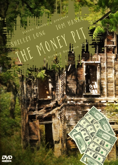
Already it’s Week 2 for the revamped Cover Makeover Challenge now administered by Julie Powell, Photographer & Graphic Artist.
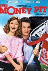
 The challenge this week was to do a cover for The Money Pit, a 1986 film starring Tom Hanks and Shelley Long. Frankly, the original poster is very dated, very ’70s in style. You may well think the same.
Storyline:
Walter Fielding and Anna Crowley have to start looking for a new house – but there’s not much they can afford! This soon changes when they meet a lonely old con artist who sells them a beautiful mansion at a ridiculously low price. Only there’s a catch. The second they move into the house it falls apart, starting with the stairway collapsing to the bathtub falling through the floor to eventually the chimney falling into the house! Finally, they have to renovate the house before the frame collapses but the renovations also prove to be a disaster. IMdb
I had no idea how to do a cover for this film and pondered for several days. Today, realising that time was of the essence, I found a photograph of a dilapidated, abandoned house from Wikimedia and looked at it for several hours!
One texture from Kerstin Frank to brighten the original image and a green box with details of the stars, director and producer, and I had to stop and ponder once more.
I was happy with the fonts — Skia Regular for Steven Spielberg and Richard Benjamin, and Shopaholic Regular for Shelley Long, Tom Hanks and The Money Pit — but the box on which I had placed the title and names made it look far more like a book cover than a film or DVD poster. I’ll tilt it, I thought. I tilted it but I still wasn’t happy.
Then I realised I could roughen the boundary edges of the box with one of Photoshop’s distort tools. I ended up using ZigZag. I liked it.
Final touches were the dollars and a DVD symbol from Wikimedia and that was it. It still looks more like a book cover to me but what the hell!
Click here for instructions if you would like to take part in future challenges.
Take care and keep laughing!


I am not a great fan of Hanks, or American comedies, but I confess that I laughed out loud at this film.
Nice makeover, Sarah, it tells the story.
Best wishes, Pete. x
LikeLiked by 1 person
Thanks, Pete.
LikeLiked by 1 person
Delightful! 😃
LikeLiked by 1 person
Thank you, Joanne. Glad you like it.
LikeLiked by 1 person
I like it, love the house image, that sure is dilapidated. Thanks for sharing and joining in
LikeLiked by 1 person
Much thanks, Julz. There were a lot of dilapidated houses to choose from on Wikimedia!
LikeLiked by 1 person
I have never looked, I’ll had it to my bucket list
LikeLiked by 1 person
A great poster Sarah. I hope you’re feeling better now and the pain has been dealt with from the jaw.Maybe the double vision from he cataract op has also gone so you can get new specs, I really hope so.
Keep well, I’m thinking of you.
xxx Gigantic Hugs xxx
LikeLiked by 1 person
Bless you, David. I’m feeling marginally better, thank you. The antibiotics are wiping me out! Going for a second opinion on the eye today. Hugs xxx
LikeLiked by 1 person
Good Luck with the second opinion. Sorry the antibiotics are wiping you out but as long as they’re doing you some good. It’s the pain I want to see the back of. That’s really debilitating.
xxx Ginormous Hugs xxx
LikeLiked by 1 person
Thank you for your concern, David. The pain is lessening. The second opinion was illuminating and I understand much more what’s been done and why as well as what the future brings. The guy who did the op at the hospital doesn’t speak much English and is rather vague about things! xxx
LikeLiked by 1 person
LOVE the font! Makes this film look like an indy art-house film.
LikeLiked by 1 person
That font is one of my favourites! I have to be careful how often I use it.
LikeLiked by 1 person