
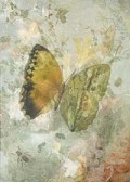
 I’m entering another challenge. Who’d ‘ave thunk it! It’s actually a form of creative procrastination since although I have several pieces in the pipeline on my digital drawing board, as it were, I’m not happy with any of them at the moment. See a sneak peek of one on the right!
The Photo Rehab Cover Makeover is run every week by Desley Jane of Musings of a Frequent Flying Scientist and Lucile of Lucile de Goday. The idea is to re-imagine a new cover for a known work, whether a book, an album, or a movie, by adding your own photo and embellishments. For the latest challenge, we are asked to re-do a bar of chocolate – a particularly uninspiring packaging design as you can see!

I used a detail from one of my Christmas pieces which had been created using a photograph of a bowl of grapes to which I had added textures as well as leaves with Photoshop brushes. Since the original chocolate bar has the legend ‘Fair Trade, Fair Taste’, it seemed an appropriate detail of that image suggesting, as it does to me, the goodness of unadulterated food.
![Original & vintage art © First Night Design [www.firstnightdesign.wordpress.com]](https://firstnightdesign.files.wordpress.com/2015/08/photorehabcovermakeoveraugust.jpg?w=464&h=754)
I took as my lead the violet and teal hues of this detail to fashion the bands of colour containing the brand name and the type of chocolate. The lemon for the citrus taste is from The Graphics Fairy.
Click here for instructions if you would like to take part in future challenges.
I suspect that since my adaptation is not obviously photographic, even though it was a photograph originally, it might not qualify for the challenge. But never mind!
Take care and keep laughing!


I think I’d buy that chocolate. You’ve made a very attractive wrapper and clearly let us know what to expect. What could be better.
xxx Massive Hugs Sarah xxx
LikeLiked by 1 person
Bless your heart, David. xxx Massive Hugs xxx
LikeLiked by 1 person
If I saw chocolate in a shop with that wrapper I would buy it just for the wrapper if nothing else…it’s fantastic and I would be amazed if this design was not recognised….do keep us posted. Meanwhile, like the butterfly and keep smiling…have a good Monday and week ahead….janet. xx
LikeLiked by 1 person
Thank you, Janet. 😀
LikeLiked by 1 person
If the idea of chocolate were not already enough, I’m sure I’d be lured by that packaging idea Sarah! Love the greens and lilacs 🙂
LikeLiked by 1 person
Blessings, Jane! 😀
LikeLike
I agree with the others. You have taken something bland, and made it into an attractive, premium-looking product that could be on sale in Harrods or Fortnums. You should contact the company, and offer your services!
Best wishes, Pete.
LikeLiked by 1 person
You’re a doll – thank you very much.
LikeLike
Delicious Sarah – perfect wrapper. I see a whole new line of products as a private label for some famous chocolate houses. Beautiful design.
LikeLiked by 1 person
Much thanks, Mary – music (or should I say chocolate) to my ears!
LikeLiked by 1 person
Good one!
LikeLiked by 1 person
Okay, you’ve left me gulping for breath having been blown out of the water by your design – LOVE IT! 😉
LikeLiked by 1 person
Bless you, Joanne. Hope you’ve got your breath back now!
LikeLiked by 1 person
Looks fantastic! Very tempting and beautiful wrapping.
LikeLiked by 1 person
Much thanks, masgautsen. Clearly I shall have to start manufacturing chocolate with this wrapping!
LikeLiked by 1 person
If i saw one in a shop here in Norway I would get one!
LikeLiked by 1 person
That’s an amazing compliment – thank you. 😀
LikeLiked by 1 person
Would be a bit shameful to open it, but it is chocolate so it has to be eaten.
LikeLike
This is so pretty! I like this wrapper very much. The colours are lovely and incorporating citrus is a great idea. Thanks so much for joining he challenge with such a wonderful cover makeover.
LikeLiked by 1 person
Thank you so much – I’m delighted you like it, Desley! Do I still need to add the link to the inklinx (or whatever it’s called!) page?
LikeLiked by 1 person
You are welcome to add it there so more people can find you. But for my wrap up on Thursday, it’s ok, I can find it here. Cheers!!
LikeLiked by 1 person
Reblogged this on ' Ace Friends News ' and commented:
http://flip.it/cLyTw
LikeLiked by 1 person
Love the colors of that! It would grab my attention.
janet
LikeLiked by 1 person
Thanks so much, Janet – you’ve made my day, which had been bleak until just now having waited to see the doctor for three hours!
LikeLike