
Week 21? Who’d ‘ave thunk. I didn’t have a chance to take part in The Photo Rehab Cover Makeover last week. Run by Desley Jane of Musings of a Frequent Flying Scientist and Lucile of Lucile de Goday, the challenge this time is to re-imagine a cover for the horror film, The Conjuring. No, I’ve never heard of it either and probably won’t rush to see it as I’m not a particular fan of horror, unless it’s the subtle variety like The Turn of the Screw.
In 1971, Carolyn and Roger Perron move their family into a dilapidated Rhode Island farm house and soon strange things start happening around it with escalating nightmarish terror. In desperation, Carolyn contacts the noted paranormal investigators, Ed and Lorraine Warren, to examine the house. What the Warrens discover is a whole area steeped in a satanic haunting that is now targeting the Perron family wherever they go. To stop this evil, the Warrens will have to call upon all their skills and spiritual strength to defeat this spectral menace at its source that threatens to destroy everyone involved. IMdb
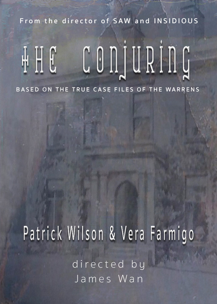
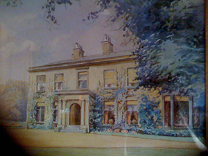
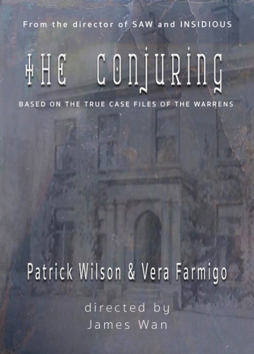
The main image (luminosity mode) is a bad iPhone photograph of a painting showing a house — somewhere in Herefordshire, I think — that used to belong to my mother’s family. If you ignore the dirty marks of the mobile’s screen, the residence looks rather grand. What I wouldn’t have done to inherit it!
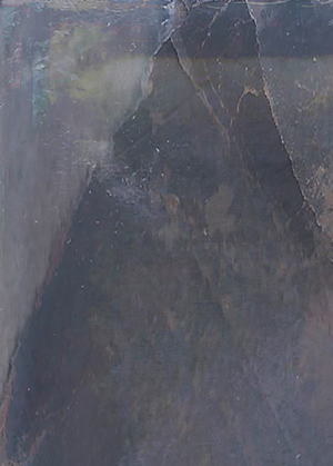
The underlay (normal mode) is part of a texture by 2 Lil’ Owls.
I sharpened edges and adjusted contrast on both images in Photoshop before adding the text.
‘From the director of Saw and Insidious’, ‘Based on the true case files of The Warrens’, the actors’ names and ‘directed by James Wan’ are all in Sukhumvit Set Semi Bold. The title font is Catharsis Requiem Bold, which seemed rather appropriate with its nod to the Gothic. I also gave the title and the actors a bevel and emboss, drop shadow and inner glow style.
Click here for instructions if you would like to take part in future challenges.
Take care and keep laughing!


I love what you have done here….and oh yes what a gracious house that is…….do you know if it’s still there and in good condition? One never knows these days. Thank you and enjoy your day…keep smiling:)xx
LikeLiked by 1 person
Thank you, Janet. It no longer exists, sadly. And I simply can’t remember the name of the house or the county it’s in and there’s no one around to remind me. It’s possibly written on the underside of the frame but it’s still packed in a box so I can’t find it easily!
LikeLike
It would be fascinating to learn about the history of the house….one day:)xx
LikeLike
Sarah, this is fabulous! 🙂
LikeLiked by 1 person
Bless you, Joanne. 🙂
LikeLiked by 1 person
A wonderful work Sarah, wow on the layering of these two pieces – the end tonal design gives this a great feel. Love this one!
LikeLiked by 1 person
Much thanks, Mary, for your unwavering support.
LikeLiked by 1 person
Another one that would make a fabulous book cover. Gorgeous, Sarah!
LikeLiked by 1 person
Bless your heart, Olga.
LikeLike
A genuine Gothic feel, and so suitable for the subject matter, from colour to font choice. Great stuff, Sarah.
Best wishes, Pete. x
LikeLiked by 1 person
My thanks to you, Pete. That’s music to my ears.
LikeLike
Very interesting this photo make over! Nice!
LikeLiked by 1 person
Thank you!
LikeLiked by 1 person
most welcome, you are always so creative!
LikeLiked by 1 person
Oh I really like this! Love the idea of taking a photo you may not have kept and using it for something like this – that’s my kind of makeover. Your fonts are awesome too. Love the cross-shape of the T. Thanks so much for joining again, it’s fabulous.
LikeLiked by 1 person
Bless you, Desley. Wishing you a wonderful holiday and a great 2016!
LikeLiked by 1 person
Thank you and best wishes to you too!!
LikeLiked by 1 person