
It’s Week 9 of the Photo Rehab Cover Makeover run by Desley Jane of Musings of a Frequent Flying Scientist and Lucile of Lucile de Goday. Actually, it might not be Week 9 — I seem to have got mixed up as I titled Green Mile #7; that’s what comes of dealing with far too many emails and an explosion of other people’s lovely blog posts!
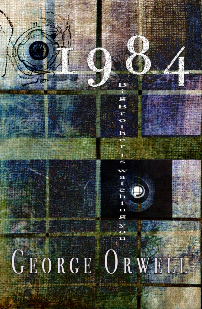
I do know, however, that this week’s challenge, as you can see above, was to do a cover for George Orwell’s classic, 1984.
I chose to use I Can See What You’re Doing as the background to give the impression of a barricade. I added the same photo from Unsplash that I used in Cabinet of Curiosities (the whirly window), and a medical drawing of an eyeball from The Graphics Fairy.
The font I’ve used (Bodoni) is not what I would have wished. I lost so many fonts last year when the computer died at the same time as the back-up (of course) and remembering the names and finding them again is proving almost impossible. The one I had in mind was what you might call ‘dirty’ and eaten into. Ah well!
Click here for instructions if you would like to take part in future challenges.
Take care and keep laughing!


I always remember the first time I read this book. I was 17 year old and had just begun art college. It was around 1962….and so 1984 seemed sooooo far off…..If you don’t win something with these covers that you are designing, I will eat my hat…and yes I do wear one occasionally. Fabulous. Keep smiling and have a great day…Janet. xx
LikeLiked by 1 person
I wear hats too – we’ll meet in Amiens wearing them! Even in the ’70s, ’84 seemed an age away. I’m so glad you like the cover. There’s nothing to be won but at least it’s going some way to building my portfolio for offering book cover services. Keep smiling! x
LikeLike
I think you would make a fabulous book illustrator and cover artist….marvellous work and yes we will meet in Picardy, wearing hats and then do some painting and eat and drink a little:):)xx
LikeLike
Great design Sarah, delightfully menacing and I think the Bodoni works rather well for the theme of the book, sort of establishment and respectable to mask the true nature of the regime! Have a thuper Thursday 🙂
LikeLiked by 1 person
I’ll have a thuper throuper Thursday and hope you do too! Much thanks for the compliments and I’m pleased you like the Bodoni. I put it in ‘dissolve’ mode so it was slightly ‘eaten away’ on close inspection. 🙂
LikeLiked by 1 person
Thplendid 😀
LikeLike
That looks great, Sarah!
LikeLiked by 1 person
Bless you for your support, Juli – always appreciated. 🙂
LikeLike
Suitably sinister, Sarah. In keeping with the story!
Best wishes, Pete. x
LikeLiked by 1 person
Ooh, thank you, Pete!
LikeLike
I have an ‘h’ at the end of my name. I’m a little particular about it!
LikeLike
Hi Sarah, I’m sorry that your cover wasn’t yet included in the wrap up. I published it before at 00:15 CET. I have just included it there and will send again to Twitter.
I love the cover, by the way. It is a fabulous design.
LikeLiked by 1 person
Thank you, Lucile. Don’t apologise – it was my fault for not publishing until this morning. Bless you for including it now.
LikeLike
You’re ever so welcome, Sarah. I won’t apologize if you don’t say it’s your fault. Deal?
Have a beautiful day.
LikeLike
How cool. I love the colours and textures in this cover. When I went back and looked a second time I saw your vertical text. Very spooky. Excellent work!!
LikeLiked by 1 person
Bless you, Desley!
LikeLike
OOh – this is good: the suggestion of prison bars, the implication you’re being watched while you’re watching others… Very unsettling, just like the book.
Such a great book! Time to read it again, methinks.
LikeLiked by 1 person
Thanks so much, Ruth. It’s time I read it again too. I haven’t picked it up since the ’70s!
LikeLike
Love Orwell’s new cover. Outstanding.
LikeLiked by 1 person
Bless you, Gigi!
LikeLike
Love it! 🙂
LikeLiked by 1 person
Much thanks, Joanne!
LikeLike
Looks great!
janet
LikeLiked by 1 person
Thank you, Janet!
LikeLike
Fantastic! I love the cover texture.
LikeLike